
You’ve had a great launch! Your trailer is racking up a big viewcount, the media love your game and your burgeoning community has all flocked to purchase it on launch day.
There’s one issue though – your key art isn’t up to scratch.
This might just be a missed opportunity amid all the success but if things haven’t gone exactly to plan then it can become a much bigger problem.
Let’s get the definition out of the way – key art is mixture of logo and artwork (that’s also known as ‘store art’ or ‘hero art’) is an essential feature on every storefront and getting it right can be the difference between having a long-tail on your launch and utter frustration. The ideal key art will convey the feel of your game in a single glance, or at least enough of it to get people clicking through to watch a trailer or wishlist it.
So here are the lessons I’ve learned making key art for games on PC and console.
Flexibility is essential
Anyone currently making games commercially will know that platform holders require key art in a frustrating array of sizes and specifications. AAA teams have marketing artists and graphic designers whose jobs are to create all the beautiful assets a publishing team could ever need along with the brand bible on how to use them.
You may need to be more flexible in your approach if you don’t have dedicated and patient art resources. Your game needs to stand out across a variety of different storefronts.


To achieve the flexibility required for today’s digital publishing make sure your logo and image assets are layered and can be scaled separately. This means that someone with limited image editing skills can still alter layers and make adjustments on the fly.
Flexibility goes beyond good file formats though. The most flexible and effective layout that many developers use consists of logo, background and hero (protagonist, vehicle, building, machine, whatever’s best for your game). In most cases I would advise developers to use the same so long as the art passes all these tests:
- Is it legible as a 120 x 45 capsule image on Steam?
- Does it look cool as a 1080p wallpaper?
- Can you take out the hero or background and still have workable art?
Grey Alien Games have kindly allowed me to deconstruct the key art of their Solitaire-RPG Shadowhand to show this flexibility in action. The elements of the key art are legible at a variety of sizes. The background or hero portrait can be removed and the asset still conveys it’s themes.
When creating art for your own game look at titles in a similar genre or where you feel there is an audience overlap and see how they’ve scaled their art. You may notice the structure I’ve outlined much less common in titles pre-2014 (pre-indiepocalypse). This isn’t because developers are all copying each other but because this method works to meet many marketing needs with quick iteration.
Avoid in-jokes or specific cultural references
Humour has been the bane of translators for centuries and in games things are no different. The visual humour in your key art may be more translatable than any wordplay but are you referencing something that might not mean much to your audience?
This is not shooting down the things in your game that look quirky or odd, they are fabulous and you should use them. I’m talking about referencing things outside your game in a way that might detract from you key art. Whilst working at Curve Digital on the QWOP-esque adventure game Manual Samuel we made changes to the key art for this reason.
The Perfectly Paranormal team had a great piece of art for Manual Samuel but it hinged on a reference to the 1989 comedy flick Weekend At Bernies. In the film two insurance company employees pretend their dead boss is still alive by physically puppeting his corpse. The plot of Manual Samuel sees Death and War (the skeletal figures) force Sam to become their puppet of sorts as he has to live each day doing everything manually.
If you made this link in your head then boom – you got a great idea about the game. If not, you needed a paragraph like this one to explain it.
Eventually it was agreed with the developers to change the art to one which makes the puppeting theme more prominent and uses two separate character assets instead of one single image for more flexibility. Last year the Curve Digital team iterated on this further by creating new art for Switch that features the console too.
Of course, you should still have fun if your game suits it. Check out the key art for Ravenfield. It’s an OTT paint-filled FPS with gameplay that parodies Battlefield titles and the art represents that, but it still works even if you don’t get the joke.
Testing and iteration are challenging but essential
Interpretation sits with beauty – in the eye of the beholder. You may hate the art I love (more on that later) and you may get a radically different impression of a game from it’s key art. There’s no way around this and you need to create art that speaks to people you want to reach whilst understanding that some of them just might never see your game.
-
Is this bad key art? The smiles are excruciating and there’s some serious editing issues. But this asset is flexible and speaks to its target audience (with only a dash of condescension). You know damn well if this is or isn’t the game for you.
I believe that creating successful key art is complex creative process that, unlike most art, is best done by committee. Options for store-based A/B testing are limited in the PC/Console sector so you’ll have to get creative. Survey colleagues and friends with variants of art and get their feedback. Any PR or distribution partners may also be helpful contacts for this.
If you’re pursuing a form of open development then your key art is something you can run by your community. Though, as with all community surveying, keep it to a simple binary choice rather than asking for detailed creative feedback as this can be unhelpful and distracting. You should also avoid publicly testing any art that you don’t want to have lingering around forever. Given how you can’t control image spread online it’s common for old or WIP key art to get used by press and content creators instead of the shiny final art you adore.
Finally, if you’re not doing this already add it to your list – test all your art in situ. Use test pages where available or an image editor to see what your art will look like across various stores when it’s live. You never know what odd conflicts or issues might arise.
Your art can do none of the above and still make $$$
Some games have key art that flies in the face of everything I’ve said above. Big brands like Total War or Far Cry will do this. If you look at either on Steam or another platform you’ll see almost identical artwork used with only slight changes in design to hint at each title’s USPs. That’s the power and privilege of big and established brand identities. See it as something to work towards and stick with a flexible layout with a hero asset.

You’ll find some games will have art that looks really simple to you or just plain ugly to you. You’ll see art that seems entirely at odds with the game it’s promoting, you’ll see a hundred ways you can make that little square image scream fun. And that’s really a good thing. If PC/console games started treating guidance as gospel then things begin to look rather homogeneous, something we’ve seen a lot of in the mobile space.
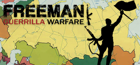
One of my favorite indie titles of 2018, Freeman: Guerrilla Warfare, has key art that I can’t stand, but the game’s sold exceptionally well so it isn’t being held back. A chunk of people may be ignoring this game due to the art but it still works and lets you know this is a game about freedom fighting in modern-day Russia.
Bonus Tips
- It’s not too late to update existing art. On Steam and 3rd party stores this is simple. The process on consoles can be more involved but is still worth doing if you have made significant updates or won big awards since launch.
- If you’re releasing on PC with 3rd party retail partners (think Fanatical, Voidu, Green Man Gaming, etc) then make sure you’re sending them PSD files too. Readily available and layered art means your game is more likely to make the cut for themed sale banners.
- If you’re reading this as someone looking to go into games marketing as a career then my bonus tip to you is to learn about the differences between CMYK and RGB and how to convert between them without totally messing up your art.
- Check out Hooked by Pactrick Fagan if you want an insight into the science of what draws people to particular adverts over others.
